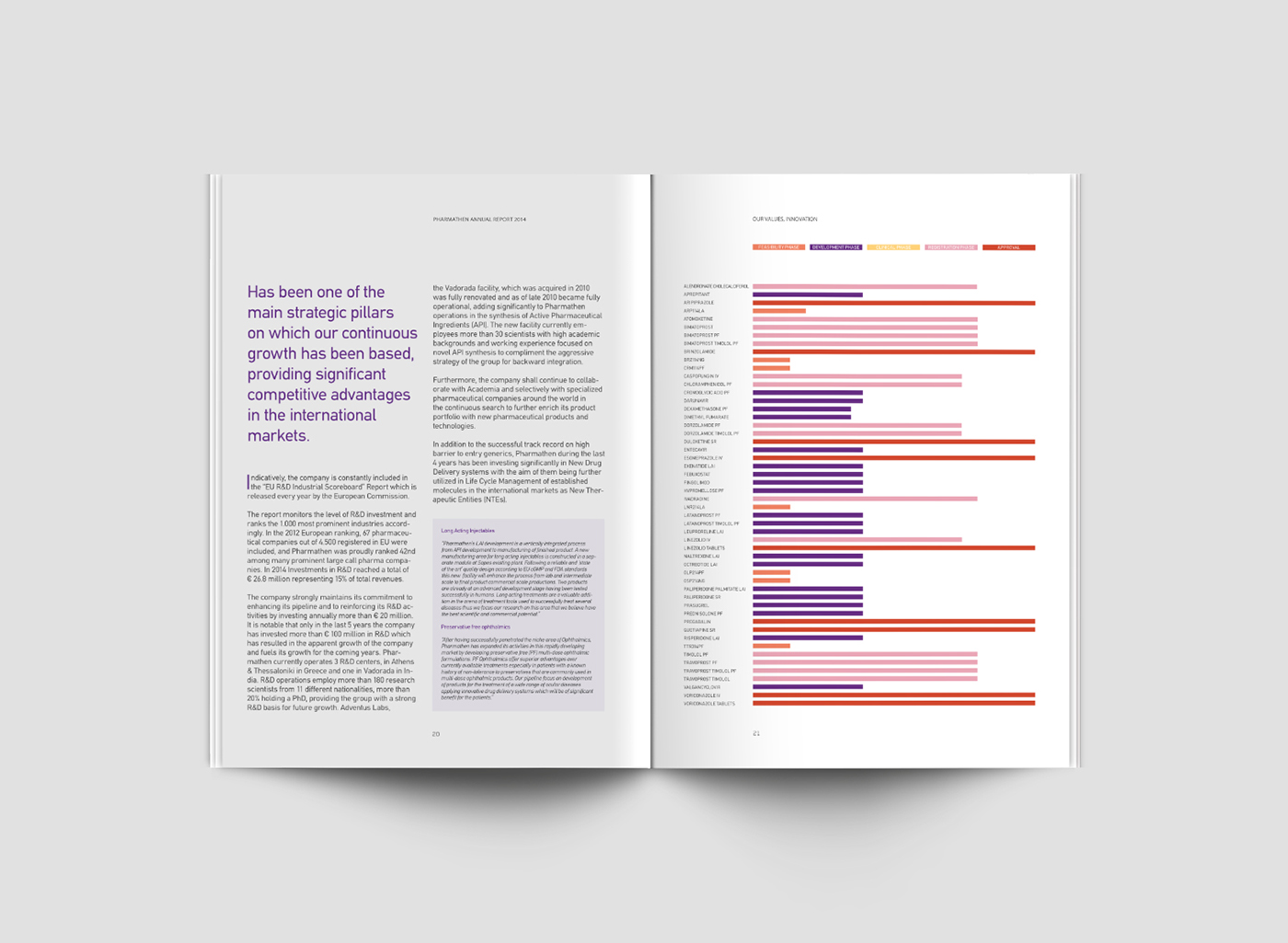
Pharmathen is a leading research-centered, pharmaceutical company for which we have been designing their corporate communications.
The annual report follows the company’s brand guidelines and has a selection of photographs highlighting the company’s focus on putting people first.
The logotype for Tovanor, a new respiratory aid, depicts the movement of air in a single breath. The print campaign refers to an airborne journey - hot air balloons like micro-spheres carried along by the wind. The medicine travels through the lungs like fresh air, restoring health and vitality.
The logotype for Xoterna is based on the shape of the lungs, the source of human breath.
We have also created the packaging for those two respiratory aids, which had to complement the pharmaceutical company’s brand identity. Each product is differentiated through the use of different typography and a distinct colour palette.


